LiveWriter toolbar
I like the LiveWriter toolbar, simple and clean. I wonder why they just didn't do away with the menus like Office 2007. At least only one menu item has subitems, so its pretty painless to use since there is no feature exploration anxiety as you learn the application.
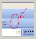
The one thing that is baffling me is the button shown below.

Its located right after the "Check Spelling" toolbar button. What does it do?
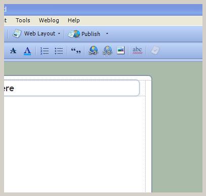
LiveWriter top right
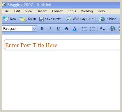
LiveWriter top left
tags: livewriter, blogging


<< Home